Enhancing the User-Friendliness of an underutilised feature in a mobile banking App.
Background Story
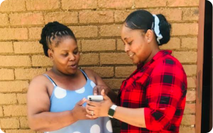
My sister asked if she could take a picture of her bank card to share banking details. I asked if she had a banking app on her phone, and she said yes. Then, I wondered why she didn’t use the app to send the details. She explained she didn’t know how.
This got me thinking about how common this problem might be. I realised it’s a chance to help others facing the same issue with using a mobile banking app to share banking details.
Phase 1: Empathise
What I did in this phase
I had conversations with my sister and 3 other app users to discover what is the problem and how my sister and other users think, see, and feel about the app.
In these informal conversations I discovered their pain points in sharing their account details and why are they not using the app.
The people that I spoke to want to refrain from taking pictures of their bank cards or sending SMS messages to share their account details. They aim to familiarise themselves more with the app, using the banking application more frequently to gain confidence in its usage.
Empathy map
Thinks
- Going through the app is difficult as she has never used it before.
- Going through the app is time consuming.
- A short cut feature would help her use the app.
- She wants to become more proficient at sending her account details using the app.
- She wants to improve her ability to use the mobile banking app to send her account details in a more efficient way.
- She wants to become more comfortable and familiar with the app’s feature to accomplish this task efficiently.
Sees
- People taking pictures of their bank cards to share their account details.
- People texting their account details to share with someone.
- Most people she knows, have the app but are struggling to use it.
Feels
- Learning more about the app will definitely make her life easier.
- She wants to feel confident when using the app.
- She would like to use the banking app frequently.
- Most people that she knows, who can’t use the app would learn to use it very quickly.
Feels
- She takes a picture of her bank card to share her account details, as she doesn’t know how to use the app.
- Sometimes she sends an sms to share her account details if she doesn’t have enough data to share via WHATSAPP.
Phase 2: Define
My current assumption is that people don’t use the “send banking details” feature because they can’t find it and aren’t familiar with using the banking app. Here’s a table of the problem scenarios, existing alternatives, and value propositions.
| Problem scenarios | Current alternatives | Value proposition |
|---|---|---|
| The app is complicated, there are so many features. | She avoids using the banking app | Educating people about the app – (TikToks and Youtube shorts of how to videos) |
| I do not know how to find the “send banking details” feature | She sends a picture of her card or WhatsApps her details, because she can’t use the app. | Educating people about the app – (TikToks and Youtube shorts of how to videos) |
Phase 3: Design
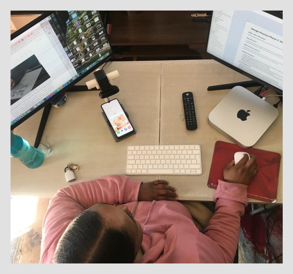
Realizing my sister had trouble sending or sharing her account details through the app, I opted to redesign and prototype the “send account details” feature. This way, I could test it to understand how many people face challenges using the feature and what specific difficulties they encounter while sending account details on the app.
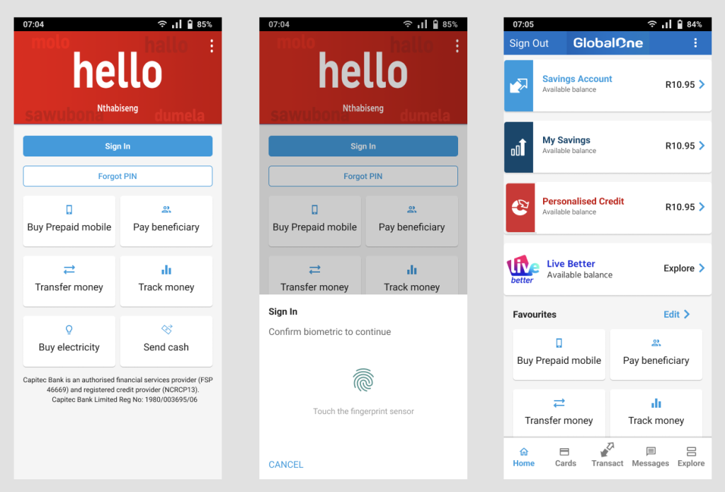
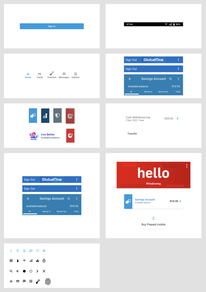
I used the Figma desktop app to design and prototype the App. Before I started designing the screens I created text styles, colour styles, Icons and a component library.
Text styles
I used Material Design standards for my design. Therefore, my font family is Roboto.
These are my four text styles:
Colour Styles
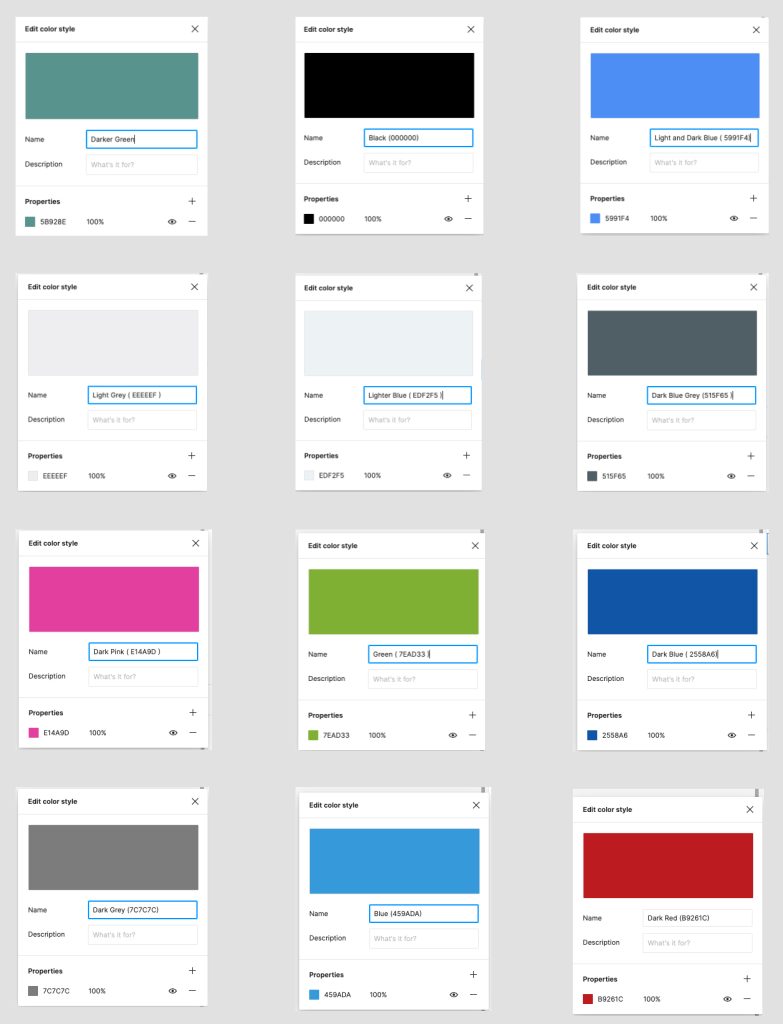
I used the colour picker to apply the app’s colours for text, strokes and other elements. This exercise resulted in these twelve colour styles.
Icons
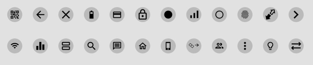
I sauced the app’s the Google Fonts website for my Icons. Once I had all the app icons on the Figma canvas, I resized the icons by making my frames 24 X 24 and my icons to 16 X 16. I changed my icons into components and I added them into my component library.
Component library
In my design, I utilized various components including the App Bar (Top), Buttons, Cards, Home Tabs (Bottom Navigation), Icons, Images, Lists, Sheets (Bottom), and Tabs (Top Navigation). The use of a component library significantly streamlined my design process, allowing for efficient drag-and-drop of elements from the assets panel directly onto my design page.
Phase 4: Test
In this phase, I first wrote my test script, which included the survey questions.
Seven user testing participants were recruited face to face.
Face to face usability test was conducted for the purpose of finding possible improvements in the application.
I used a monitor screen to monitor their progress as they are completing their task.
I used a homemade testing device and a mobile phone to conduct a test.
I was trying to find out, why my sister is not using the app, and how many people know about the send account
details feature.
The task was to “send account details to someone.”
The difficulty I was trying to solve was, how to navigate through the app to find the send account detail feature. Basically how to share or send banking details to someone.
I conducted the usability test after I have completed my prototype.
Prototype
I created a design to test my assumption about the underutilisation of the ‘Feature.’ The goal was to identify potential issues and understand why users, including my sister and other participants, are not utilising this feature effectively.
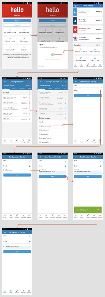
Homemade testing device
The Homemade Testing Device consists of a basic white pipe, a USB cable, a mobile holder, and a camera. To use this device, I start by connecting the USB camera cable to my computer. Then, I open the Quick Time Player App and create a new movie recording. This setup allows me to record the user’s interaction with the app directly onto my PC.
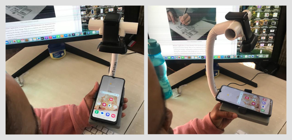
Work station
I utilise dual monitor screens: one for referencing and the other dedicated to designing.
Affinity Mapping
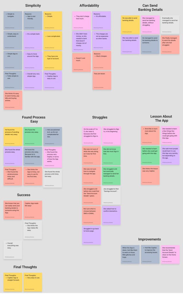
Initially, I conducted User Testing to collect feedback and insights. Following this, I employed Affinity Mapping to effectively organize and interpret the gathered data. This method allowed me to systematically group related ideas and information, facilitating a clearer understanding of the participants’ perspectives and thoughts.
User Survey
During the testing phase, I carried out a face-to-face survey to gather feedback on the ease of use of the ‘send account detail’ feature. The primary aim of this survey was to directly collect data from participants, thereby addressing issues related to this feature and gaining a deeper understanding of their needs, preferences, and pain points. This user survey was instrumental in identifying specific areas where users encounter challenges.
User Survey Questions
- Do you think that you would like to use the banking app frequently?
- Did you find the Sending Account Details option or feature unnecessarily complex? If yes, why?
- Do you think the function on the app was well integrated?
- How useful would you find a shortcut feature on your home screen that allows you to easily send your Account details to someone on the app?
- Do you think that most people would learn to use this app very quickly?
- Were you feeling confident using the app overall?
- You needed to learn a lot before you could get going with this app?
User Survey Statistics
Insights From The User Survey & Analysis
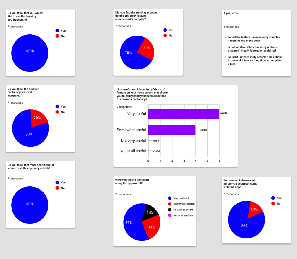
- 100% of the users would like to use the banking app frequently.
- 70% of the user did not find the sending account details option or feature unnecessarily complex.
- 80% of the users think that the function of the app was well integrated.
- 100% of the users think that most people would learn to use this app very quickly.
- 85% of the users were feeling confident using the app overall.
- 86% of the users found the app very easy to navigate, they didn’t have to learn much before they could get going with this app.
What was the outcome of the study?
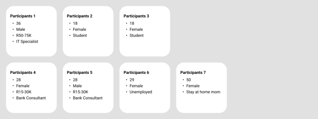
I successfully recruited seven participants, comprising two males and five females. Their ages varied, primarily ranging between 18 and 36 years, with one participant aged 50. The majority (71%) were female, and over half (57%) were already familiar with the application. These participants brought diverse professional backgrounds, aligning well with the target demographic of my research. They identified themselves as follows:
Sentiment Analysis
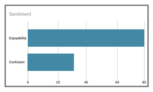
Overview of Results: A significant majority (85%) of participants had a positive experience while sending account details through the application. Conversely, 25% encountered issues during this process. Overall, the application was well-received for its ease of use, clear labeling, and intuitive design, enabling most participants to complete their tasks smoothly.
Nonetheless, there were some minor design-related feedback, particularly concerning the font size. Additionally, a few participants faced challenges in locating specific features, such as the ‘send account details’ function.
How can we address these issues?
One solution is to make the ‘Send Account Details’ feature more accessible by adding it as a shortcut in the app’s main menu. This change would allow users to locate it quickly and easily.
Additionally, providing users with clear guidance on navigating the app, including instructions for using other important features like ‘Sending Cash’, can enhance their experience. This could eliminate the need for users to physically go to the bank for such transactions.
Finally, implementing a tutorial or an onboarding process for new users could significantly improve their initial interaction with the app.
Conclusion: What did I learn from this project?
The importance of the design process became abundantly clear to me. Through this project, I enhanced my knowledge and skills across various design aspects, including:
- Conducting user surveys and analyses.
- Designing user interfaces tailored to user needs.
- Developing high-fidelity prototypes.
In summary, this project was instrumental in my growth as a designer. It reinforced the value of actively listening to user feedback and understanding their perspectives. Emphasising empathy for the user is crucial, as it leads to more effective and user-centered solutions.

Let’s connect on LinkedIn